Setting up your design for CMYK Digital printing

Before diving into your next package design, it's crucial to familiarise yourself with the printing process used to produce it to ensure the best results possible. Orders placed online with us are printed using CMYK digital printing, a method that is fast becoming the preferred option amongst brands due to its range of sustainable benefits and manufacturing efficiencies that can be passed back to consumers.
What is CMYK digital printing?
To summarise, CMYK digital printing is the process of printing an electronic file (PDF) directly to the surface of the material. This method eliminates the need for any tooling and setup costs on artwork, allowing brands of all sizes to get involved with custom packaging at a fraction of the cost.
The Benefits of Using CMYK
Thanks to its print-on-demand process, CMYK printing eliminates the need for excess material to produce your order, meaning nothing goes to waste on the production of your packaging. This, in turn, saves you money as you are only paying for what is needed. Other advantages of digital printing aside from the sustainable benefits are the ability to order smaller volumes and scale up as needed.
Our products are primarily available from as low as a sample (1) or 10 units through our online store. This allows brands to order at their own pace and trial or test new product and designs before committing to larger purchases.
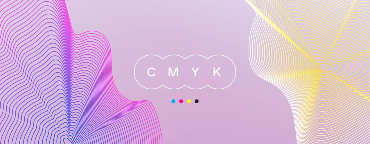
The CMYK Colour Model: Subtractive and Additive
The CMYK colour model is a subtractive colour model, used in colour printing, and is also used to describe the printing process itself. CMYK refers to the four inks used in some colour printing: cyan, magenta, yellow, and key (black). The "K" in CMYK stands for key because in four-colour printing, cyan, magenta, and yellow printing plates are carefully keyed, or aligned, with the key of the black key plate.
On the other hand, RGB is an additive colour model in which red, green, and blue light are added together in various ways to reproduce a broad array of colours. The main purpose of the RGB colour model is for the sensing, representation, and display of images in electronic systems, such as televisions and computers, though it has also been used in conventional photography.
RGB to CMYK: Making the Switch
When it comes to print collateral, most printers use the CMYK colour model. This means that if your design is in RGB, you'll need to convert it to a CMYK colourspace before sending it to the printer. This is because the RGB colour model is used for digital designs, while the CMYK colour model is used for print. By converting your design from RGB to CMYK, you'll ensure that the colours in your design will print accurately.
Digital Printing vs Traditional Printing
Previously, printing custom packaging in Australia was a limited option to consumers due to the higher minimum order requirements to offset production costs through traditional Flexographic and Offset (Lithographic) processes. While traditional processes offer exact Pantone color matches, it isn't a viable option to many brands as the commitment to capital outlay cannot be justified.
Digital production, which has heavily innovated over the past five years, accommodates this gap in the market, allowing brands to get involved more efficiently while providing near-identical results.
Choosing the Right Material for CMYK Printing
Choosing your material will set the tone for your entire design, as this will determine how your color choices are printed when applied to each surface. We offer up to 4 material options across our cardboard products and one choice for our card-stock products.
- White: Our most popular option available. This material uses an uncoated white surface on both sides of the cardboard, which can be used as a canvas to print any colour and design in matte mode with stunning results.
- Kraft: It uses a classic natural brown surface on both sides of the cardboard, helping your packaging achieve a simplistic and sustainable look and feel. We'd suggest sticking with darker colour tones for best results on this material, as lighter colours can appear slightly 'washed' when applied due to how the natural surface absorbs it.
- Kraft-White: Combining the design principles outlined above, this material option uses a kraft surface for the outside and a white surface for the inside of your packaging. Giving you the ability to access the benefits of both options creatively.
- Coated-White: Like the principles outlined above in white, this option uses a coated outside surface to provide a more premium overall feel and optional gloss mode printing. A great choice of material if your design uses bold and deep colours with contrasting white elements. If you have an overall black design, we'd recommend against using Coated White as the ink coverage density may not be suitable for this surface choice. Also, avoid using faint pastel and pale colours, as these are better suited to 'White' instead.
Choosing the right colours
When choosing the best colours for your design, it's essential that you've considered your material selection first. Also key is that you understand the difference in results between Digital and Offset (Lithographic) production, in that how Pantone or screen colours you have selected will appear once printed.
Remember that printing in solid Pantone colour is only a viable option for you when printing above 2000 units to absorb the setup costs of Offset printing.
Digital production will print all Pantone in the nearest CMYK equivalent with no setup costs, quicker turnaround times and near-identical results.
Full-colour designs
Designs that use a range of any colour combination, whether light or dark, complete or minimal coverage and anything else in between, then your best starting point would be to select White as your material option, as this accommodates all colours true to design.
Dark colours: All of our material options are suitable for printing darker colour tones with stunning results.
Pastel colours: Using pastel tones throughout your design, we'd suggest choosing your material selection as White to ensure the best printing results, as this uncoated material option best absorbs and compliments this kind of shade. Avoid using very faint tones as if to light these may not show up as strong once printed.
Deep colours: Deeper colour tones will always result in the best finishes when applied to White or LUX Coat surfaces. They'll appear strong and solid, closely resembling Pantone selections.
Black backgrounds: Artworks that use predominately black backgrounds throughout their design are best to select White as the material option. The uncoated surface will enhance the black and provide crisp contrasting elements providing an overall premium feel. Alternatively, you could choose to print black onto Kraft for a stunning minimal appearance.
When your design is overall solid black, always print in matte mode and avoid using Coated White as your surface as the density of the ink is not compatible in gloss just yet (we're working on it!)
White backgrounds: When your design uses a predominately white background, it's an excellent opportunity to consider using Coated White as your material option, as the semi-gloss coated surface provides a premium look and feel to all-white exterior areas.
Kraft packaging: Sometimes less can be more - Kraft packaging is a great way to showcase this. When designing for Kraft surfaces, you should ensure that you only use dark and navy hues for the best results. Black will appear as black. However, colours will appear slightly dulled once printed as the surface absorbs it, so to avoid this, keep colours as bold or deep as you can.
White ink: Currently, a limitation of digital printing, we cannot print white ink directly to kraft surfaces. Meaning any white areas within your design will be left as unprinted surface area.If you are interested in pursuing white-on-kraft further, select a quantity option labelled ‘Quote’ to review pricing for this option.
Board Grades: To keep things simple, we only utilise two board-grade options across our entire (cardboard) product category.
These are E-Flute (approx. 1.5mm thick) and B-Flute (approx. 4mm thick). E-Flute is a sturdy, lightweight board popular amongst eCommerce and retail brands due to its durability and economical offering. Whereas, B-Flute, is suitable when the packaging contents is heavier, fragile or just requires that extra bit of added protection for peace of mind.
We've taken the guesswork out of it for you and pre-selected these options to best suit each of our product options. You can find this information located in the left-hand column of each products design template.
Key Considerations for CMYK Printing
Now that you have had the rundown on digital printing, the last few things we would suggest are to familiarise yourself with our printing guidelines found in the download folder of your design template.
We want to ensure that you understand the differences between Digital production, Flexographic and Offset (Lithographic), as well as the benefits offered by each to align with your needs and requirements for wherever you stand within your businesses journey!
To reiterate everything, Lithographic, whilst offers stunning results on exact matches on PMS (Pantone) colors, requires a minimum order of 2000 units and an initial set up cost for your first order.
Whereas if you can't justify that outlay cost, CMYK digital production using the sizes available on our online store is the next best thing available, offering sustainable production whilst skipping the setup fees with near-identical results from as little as 1-10 units.
Conclusion
CMYK digital printing is a versatile and cost-effective method for producing high-quality print collateral. By understanding the CMYK color model and how to effectively use it in your designs, you can ensure that your printed materials look their best. Whether you're a small business looking to print a small run of promotional materials or a large corporation needing thousands of brochures, CMYK digital printing can meet your needs.
Ready to elevate your brand experience? Visit our online store to get started.